
July 27, 2026
A Practical Look at Endtest for Visual Checks on Dynamic Charts, Heatmaps, and Data-Rich Dashboards
A practical look at Endtest for dashboard visual testing, including loading states, animated charts, tooltip overlays, async data swaps, and viewport drift.
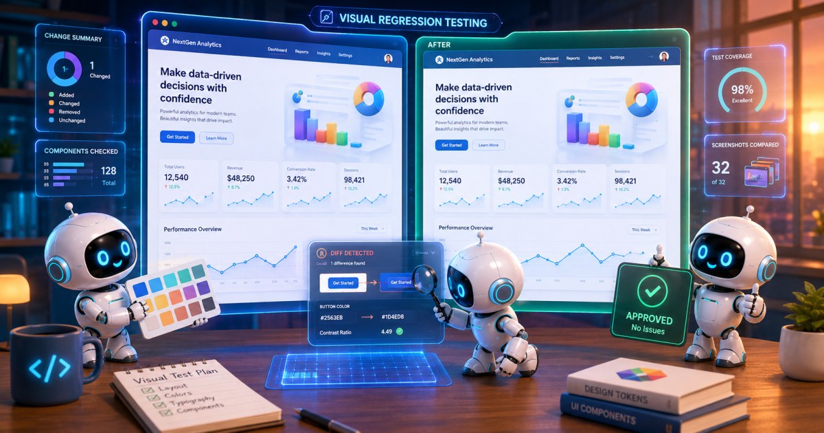
Dynamic dashboards are where visual testing stops being a tidy concept and turns into a fight with real product behavior. Charts animate in, numbers settle after async calls, tooltips appear only on hover, heatmaps redraw on resize, and every viewport size seems to reveal a different class of layout drift. Functional checks can tell you that a response code was 200 and a chart API returned data, but they rarely tell you whether the dashboard still makes sense to a human.
That is the gap tools like Endtest are trying to close. For teams that need repeatable visual checks on dashboards without building a large amount of custom test plumbing, the interesting question is not whether visual testing is useful. It is where it breaks, how much setup it really takes, and whether a low-code, agentic AI approach can keep up with the messiness of real dashboards.
Why dashboards are harder than ordinary UI screens
A static settings page is a forgiving target for visual regression. If the button moves a few pixels, the test usually knows what happened and why. A dashboard is less forgiving and less deterministic.
The common failure modes are predictable:
- Loading states: skeletons and spinners can be visible for different durations depending on cache warmup, network latency, or backend load.
- Animated charts: bars, lines, and canvas-based renderers may settle after several frames, which makes a screenshot taken too early misleading.
- Tooltip overlays: hover-only labels can cover the very element you are trying to verify.
- Async data swaps: one API response may render before another, producing temporary mixed states that are technically correct but visually noisy.
- Viewport drift: dashboards often have responsive breakpoints, sticky headers, side panels, and cards that wrap differently on small screens.
- Localized formatting: thousand separators, decimals, date formats, and currency symbols can change by locale without any bug in the rendering layer.
- Cross-browser rendering: fonts, antialiasing, chart canvas behavior, and scrollbars can vary enough to trigger false positives.
These are not edge cases. They are the normal behavior of data-heavy UIs.
The hard part is not spotting that a dashboard changed. The hard part is deciding whether the change is meaningful.
That is why the design of the visual test matters as much as the tool. A screenshot comparison that treats every pixel as sacred will create noise. A test that is too forgiving can miss actual regressions in layout, annotation placement, clipping, or missing chart series.
What to verify on a data-rich dashboard
Visual checks on dashboards work best when they target the parts of the interface that humans actually depend on to interpret data correctly.
A practical checklist looks like this:
1. Structural layout
Check whether the major regions are still where users expect them, including the filter bar, navigation, KPI tiles, chart grid, and detail panels. If a card suddenly wraps to a new line or overlaps another component, the dashboard may still be functional, but it has become much harder to read.
2. Key chart geometry
Verify that chart series, axes, legends, and annotations are present and not clipped. This matters more than exact line thickness or anti-aliasing differences. In many teams, the visual contract is really about geometry and legibility, not pixel-perfect sameness.
3. Empty, loading, and partial-data states
A dashboard is not only its fully loaded state. Validate the skeleton screen, the error banner, the partial-results state, and any fallback message shown when one data source fails.
4. Interactive overlays
Tooltips, drill-down menus, and hover states are often where bugs hide. A tooltip that escapes the chart container or renders under a sticky header can make the whole feature look broken.
5. Responsive behavior
Use at least a few representative viewport sizes, not because every pixel must match, but because dashboards often fail at the exact widths teams forget to exercise: a common laptop size, a smaller laptop, and one mobile or tablet breakpoint if the product claims to support them.
6. Data freshness indicators
If the app shows timestamps, sync indicators, or “last updated” badges, those elements should be covered as part of visual checks because they often regress when the refresh pipeline changes.
Where Endtest fits for dashboard visual testing
Endtest is an agentic AI test automation platform with low-code and no-code workflows. For teams looking at Endtest for dashboard visual testing, the main attraction is not just screenshot comparison, it is the ability to define visual checks in a way that stays readable and editable inside the platform.
According to Endtest’s Visual AI documentation, it can add visual AI steps to tests to compare screenshots intelligently and flag meaningful visual changes only. The product page also notes that teams can reduce manual time spent creating, validating, or maintaining tests, and can limit checks to specific areas of a page or use AI assertions for dynamic content.
That matters for dashboards because the target is usually not the entire page. It is the stable region around the chart, the KPI row, or the filter panel, while the rest of the page may contain live data, rotating timestamps, or user-specific content.
In practice, that makes Endtest interesting in three ways:
- It gives you a way to scope visual assertions, which is crucial when only part of the page is stable.
- It keeps test steps editable and human-readable, which helps when QA, frontend, and product analytics teams all need to understand what is being checked.
- It reduces custom harness work, especially when the alternative would be glue code for screenshots, masking, baselines, and retry logic.
If your team has ever written a beautiful screenshot test harness and then spent months maintaining it, you already know why this matters.
The main tradeoff: flexibility versus plumbing
The usual argument for custom visual testing code is control. You can write exactly the waits you want, mask whatever you want, and plug the test into any CI pipeline.
That control has a cost:
- You own the screenshot timing logic.
- You own the baseline storage and update flow.
- You own the masking strategy for dynamic areas.
- You own the debugging story when a diff is real but not obvious.
- You own browser and environment drift.
Endtest’s value proposition is that it absorbs much of that plumbing into the platform. The tradeoff is that you work within its step model and visual AI behavior rather than hand-authoring every low-level detail.
For dashboards, that is often a good trade. Most teams do not need infinite flexibility. They need repeatable checks on a specific set of screens that tend to break in the same ways.
A useful mental model for selecting visual checks
Before adding dashboard tests, separate the UI into three zones:
Stable zone
This includes elements that should remain visually consistent across runs, such as navigation chrome, card layout, axis placement, and panel sizing.
Controlled dynamic zone
This includes content that changes, but in ways you can constrain, such as a chart area after data has loaded, a tooltip after a known hover action, or a selected filter state.
Uncontrolled dynamic zone
This includes values that constantly change or are user-specific, such as live tickers, timestamps, rotating feeds, and personalized recommendations.
A practical visual test strategy focuses on the stable and controlled zones, and ignores or masks the uncontrolled zone. That is exactly the kind of setup where a platform like Endtest can simplify the work, because the team can describe what to watch, rather than build and maintain bespoke screenshot plumbing.
If a test fails every time the clock changes, the test is not protecting the product, it is protecting the clock.
How to structure visual checks for dynamic charts
Charts are the classic trap. They are often the most important elements on the page and the most likely to produce false positives.
Wait for the chart to settle
Do not capture the chart while it is still animating. If the chart library emits a ready event, use it. If not, wait for a stable DOM state and a short visual stabilization window. The wrong screenshot often comes from taking the image one frame too soon.
Use region-scoped assertions
A chart page often contains unrelated moving parts. Restrict the check to the chart container, title, and legend rather than the full browser viewport. Endtest’s ability to limit checks to specific areas is useful here because it reduces noise from timestamps, sticky headers, and other page furniture.
Verify the important shape, not every shade
For line charts, the important questions are whether the series exists, whether it is clipped, and whether labels are readable. For heatmaps, look for the expected grid structure and color scale presence. Exact color variance can be tricky across browsers, antialiasing, and display settings, so the test should be tuned to the product’s risk, not to an idealized bitmap.
Check the hover path separately
Tooltips are often rendered in a different DOM layer or portal. If a chart requires hover interaction to expose values, add a separate step for hover and visual assertion. Otherwise, the main chart screenshot can look fine while the user-facing detail layer is broken.
A small Playwright pattern that illustrates the problem
Even if your team uses Endtest, it helps to remember what the custom-code alternative looks like. This is the kind of logic teams often end up writing by hand:
import { test, expect } from '@playwright/test';
test('dashboard chart settles before capture', async ({ page }) => {
  await page.goto('/analytics');
  await page.locator('[data-testid="kpi-chart"]').waitFor();
  await page.waitForTimeout(1500);
  await expect(page.locator('[data-testid="kpi-chart"]')).toHaveScreenshot('kpi-chart.png');
});
This is short, but it hides a lot of maintenance: deciding whether 1500 is enough, whether the chart is really settled, how to mask volatile regions, and what to do when the screenshot diff is caused by a font or rendering change rather than a defect.
A low-code workflow with human-readable test steps reduces that friction. Instead of managing a pile of support code, the team can inspect the visual step itself, understand what it is checking, and update the baseline or scope when the UI changes intentionally.
What Endtest seems well suited for, and what it is not
Good fit cases
Endtest is a strong fit when the dashboard has:
- a limited number of critical screens,
- repeatable interaction paths,
- obvious stable containers for charts and cards,
- a need for visual regression checks across browsers or devices,
- a team that wants less framework maintenance.
This is especially true when the team wants to validate visible regressions without building a separate screenshot harness, masking system, and baseline approval process.
Less ideal cases
No tool is magic. Endtest will be less attractive if:
- your dashboard is highly personalized and every screen is unique,
- the UI is dominated by continuously changing live data,
- you need extremely custom assertions around SVG internals or canvas-level detail,
- your team already has a mature visual regression stack and only needs one extra assertion type.
In those cases, custom code can still be justified. The important thing is to be honest about ownership. A hand-built solution is not free just because it is already in the repo.
A practical dashboard testing recipe
Here is a reasonable sequence for teams introducing visual checks on a data-rich dashboard:
- Pick one high-value dashboard screen with known regression risk.
- Identify the stable regions that users rely on to read the page.
- Decide what to mask or scope out before writing the first check.
- Add one loading-state test and one loaded-state test.
- Add one interaction test for a tooltip or drill-down overlay.
- Run the test across a small viewport set that reflects actual usage.
- Review false positives before widening coverage.
This keeps the initial rollout honest. If you start with fifty dashboard tests and no scoping strategy, the failure rate will tell you more about the test design than the product quality.
How to think about maintenance cost
Visual testing is often sold as a quality shortcut. In reality, it shifts work around. The question is whether the shift is favorable.
A useful way to evaluate the total cost of ownership is to include:
- time spent writing waits and stabilizers,
- screenshot baseline review and approval,
- flaky-test triage,
- browser and CI environment upkeep,
- ownership transfer when the original author leaves,
- review effort for test logic that becomes opaque over time.
Endtest can reduce some of that burden by keeping the workflow inside a platform with editable steps and Visual AI logic that is designed for meaningful regression detection rather than raw pixel matching. For teams with limited QA automation bandwidth, that can be a significant practical advantage.
CI integration still matters
Even a strong visual tool is only useful if it fits the release pipeline. Dashboard checks are most effective when they run in CI on pull requests or during pre-release validation, not as a manual afterthought.
A simple GitHub Actions setup for surrounding checks may look like this:
name: dashboard-checks
on:
  pull_request:
  push:
    branches: [main]
jobs:
  visual:
    runs-on: ubuntu-latest
    steps:
      - uses: actions/checkout@v4
      - name: Run dashboard smoke tests
        run: echo "Trigger dashboard visual suite"
The details will vary by platform, but the principle is steady. Visual regression checks should sit close to the code that changes layout, data binding, and chart configuration.
When to combine functional and visual assertions
A useful dashboard test is usually not visual-only. It should mix behavior and appearance.
For example:
- confirm the API returns the expected dataset,
- wait for the chart to render,
- validate the chart container and legend visually,
- hover a point and check the tooltip text,
- verify the selected filter state remains visible.
This layered approach catches more real bugs than any single assertion type.
Functional checks tell you the data path is alive. Visual checks tell you the user can actually read the result.
Endtest versus building your own stack
If your team is deciding between Endtest and a custom framework, the deciding factors are usually not raw capability. They are operational simplicity and maintainability.
A custom stack can be compelling when you need:
- fine-grained DOM control,
- bespoke diffing logic,
- special integrations with internal infrastructure,
- deeply customized screenshot masking.
Endtest is compelling when you need:
- quick adoption across teams,
- readable, editable test steps,
- AI-assisted visual validation for dynamic UIs,
- less custom code around screenshot management,
- a practical way to cover dashboards that keep changing in ordinary, annoying ways.
For many teams shipping analytics products, the second list is the one that matters more.
Bottom line
Dynamic dashboards fail in boring but expensive ways. They load in stages, animate at awkward times, shift under different viewports, and hide important information behind overlays. Those are exactly the places where visual checks earn their keep.
Endtest’s Visual AI workflow is a credible option for teams that want Endtest for dashboard visual testing without turning the project into a maintenance hobby. The platform’s support for scoped visual checks, AI-based validation, and editable steps makes it a practical fit for charts, heatmaps, and other data-rich interfaces where the main goal is to catch meaningful regressions, not to fight the screenshot harness.
For teams evaluating tools in this space, the best question is not whether the tool can compare images. It is whether it can help you keep dashboard tests stable enough to trust, and simple enough that someone will still understand them six months later.
Related benchmark and evaluation reading
- Endtest review on BugBench
- Dashboard testing benchmarks and tool comparisons
- Visual regression testing methods for dynamic interfaces